


分享一个域名跳转单页
这个单页是ai写的,由于我的博客更换域名旧域名就没啥用了,就直接找了个免费的域名跳转网站解析后再跳转到新域名,因为我的浏览器一直都开着广告拦截就没发现有广告,我手机访问的时候才发现跳转界面竟然有广告,就干脆让ai写了一个简单的跳转网页代码如下
<!DOCTYPE html>
<html lang="zh-CN">
<head>
<meta charset="UTF-8">
<meta name="viewport" content="width=device-width, initial-scale=1.0">
<title>正在跳转至新博客</title>
<style>
* {
margin: 0;
padding: 0;
box-sizing: border-box;
}
:root {
--primary: #6366f1;
--primary-light: #a5b4fc;
--bg: #f8fafc;
--card: #ffffff;
--text: #0f172a;
--subtext: #64748b;
--border: #e2e8f0;
}
@media (prefers-color-scheme: dark) {
:root {
--bg: #0f172a;
--card: #1e293b;
--text: #f8fafc;
--subtext: #cbd5e1;
--border: #334155;
}
}
body {
min-height: 100vh;
display: flex;
align-items: center;
justify-content: center;
font-family: -apple-system, BlinkMacSystemFont, 'Segoe UI', Roboto, 'Helvetica Neue', sans-serif;
background: var(--bg);
padding: 24px;
position: relative;
overflow: hidden;
}
.bg-gradient {
position: absolute;
top: -200px;
right: -200px;
width: 600px;
height: 600px;
background: radial-gradient(circle, var(--primary-light) 0%, transparent 60%);
opacity: 0.15;
z-index: 0;
}
.card {
background: var(--card);
border-radius: 24px;
padding: 56px 36px;
max-width: 500px;
width: 100%;
text-align: center;
box-shadow: 0 20px 60px rgba(0,0,0,0.1), 0 0 0 1px var(--border);
animation: fadeIn 0.7s cubic-bezier(0.16, 1, 0.3, 1) forwards;
position: relative;
z-index: 1;
border: 1px solid var(--border);
}
@keyframes fadeIn {
from { opacity:0; transform: translateY(30px); }
to { opacity:1; transform: translateY(0); }
}
.icon {
font-size: 64px;
margin-bottom: 24px;
animation: bounce 2s infinite ease-in-out;
}
@keyframes bounce {
0%, 100% { transform: translateY(0); }
50% { transform: translateY(-8px); }
}
h1 {
font-size: 28px;
color: var(--text);
margin-bottom: 16px;
font-weight: 700;
letter-spacing: -0.3px;
}
p {
color: var(--subtext);
font-size: 17px;
line-height: 1.7;
margin-bottom: 36px;
}
.url {
font-weight: 700;
color: var(--primary);
padding: 2px 6px;
border-radius: 6px;
background: rgba(99, 102, 241, 0.1);
}
.jump-btn {
display: inline-flex;
align-items: center;
justify-content: center;
padding: 16px 36px;
background: var(--primary);
color: #fff;
border-radius: 16px;
text-decoration: none;
font-weight: 600;
font-size: 16px;
transition: all 0.25s ease;
box-shadow: 0 4px 20px rgba(99, 102, 241, 0.3);
margin-bottom: 20px;
}
.jump-btn:hover {
transform: translateY(-3px);
box-shadow: 0 8px 25px rgba(99, 102, 241, 0.4);
}
.jump-btn:active {
transform: translateY(0);
}
.tip {
font-size: 15px;
color: var(--subtext);
opacity: 0.85;
}
.countdown {
color: var(--primary);
font-weight: 700;
}
</style>
</head>
<body>
<div class="bg-gradient"></div>
<div class="card">
<div class="icon">🚀</div>
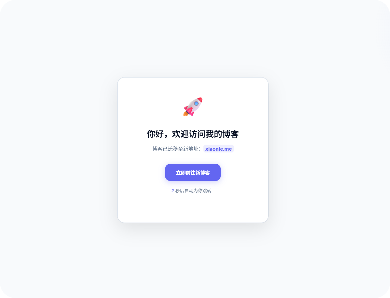
<h1>你好,欢迎访问我的博客</h1>
<p>博客已迁移至新地址:<span class="url">xiaonie.me</span></p>
<a href="https://xiaonie.me" class="jump-btn">立即前往新博客</a>
<p class="tip"><span class="countdown" id="countdown">3</span> 秒后自动为你跳转...</p>
</div>
<script>
let countdown = 3;
const countdownEl = document.getElementById('countdown');
const NEW_DOMAIN = "https://xiaonie.me";
const timer = setInterval(() => {
countdown--;
countdownEl.textContent = countdown;
if (countdown <= 0) {
clearInterval(timer);
window.location.href = NEW_DOMAIN;
}
}, 1000);
setTimeout(() => {
window.location.href = NEW_DOMAIN;
}, 3500);
</script>
</body>
</html>效果图如下
部署方法
其实部署方法有很多找一个能免费托管html的网站就好,我用的是edgeone的国内访问会比较快一点.

阅读建议


评论
匿名评论
隐私政策
你无需删除空行,直接评论以获取最佳展示效果


最近发布